Brand kit
TwoLooks brand kit
Logos, colours and type for writing about TwoLooks. Take what you need below, or download everything at once.
Download the brand kit ZIP · 350 KBLogos
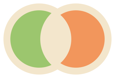
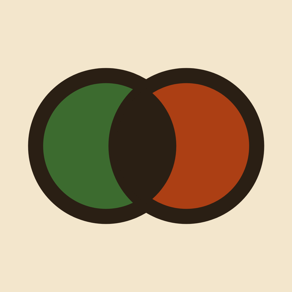
Using the logo
- Leave clear space around the mark of at least 40% of its height.
- Don't rotate, stretch or recolour it, separate the two discs, or remove the outline.
- Don't place it on burnt orange: the right disc disappears.
- On a light background, cream suits it better than white.
Name and tagline
Write the name as one word with a capital T and L: TwoLooks. TwoLooks is a Square Post Labs product.
Every buyer conversation, two looks.
The tagline always uses this wording.
Colours
Each swatch shows the light colour, and beside it the version used on dark backgrounds where there is one.
Paper
#F3E6CC · #1F1710
Backgrounds
Ink
#2A1F14 · #F3E6CC
Text and outlines
Avocado
#3C6B2F · #9CC66E
The brand colour, left disc
Avocado deep
#2A4D20 · #6E9E48
Large colour fields
Burnt orange
#AC3F14 · #F2965C
Right disc
Harvest gold
#E0A32E
Stripes and badges only, never text
Orange
#D9732B
Stripes and badges only, never text
Type
Montserrat
Headings and text
800 and 700 for headings, 400 for text.
twolooks.com 72/100
JetBrains Mono
Numbers and web addresses.
Both are free from Google Fonts under the SIL Open Font License.
Questions
Write to contact@twolooks.com.